Data visualisation is a compelling tool in the modern data-driven world, turning complex information into accessible insights. It's not just about presenting data; it's about uncovering trends and crafting compelling narratives that resonate with audiences and strengthen brand identity.
In today’s short guide, we'll explore a few inspiring and notable data visualisation examples, showcasing how these brands harnessed the power of visual storytelling to make an impact.

What Is Data Visualisation?
When most people think of data visualisation, their minds often gravitate towards traditional formats like scatter graphs, pie charts, and bar graphs, typically confined within the boundaries of static dashboards. These conventional methods have long served as the backbone for presenting data, aimed at simplifying complex information into digestible visual formats.
However, these days, data visualisation is about so much more than scatter graphs and pie charts. The evolution of this field has seen it break free from the constraints of static dashboards, embracing the mantra that "dashboards are dead". Modern data visualisation encompasses a broader spectrum of tools and techniques, integrating information, images, interactive platforms and various multimedia elements to create immersive visual narratives. This approach aims to captivate and engage audiences more effectively, turning data visualisation into a dynamic storytelling medium.
By leveraging the power of storytelling and interactivity, data visualisation now seeks to convey information in ways that resonate on a deeper level with viewers, making complex data not just accessible, but also engaging and memorable. This shift reflects a growing recognition of the importance of context, narrative, and user engagement in data interpretation, highlighting the creative and innovative potentials that lie in the art of visualising data.
Examples of Best Practices in Data Visualisation
Now let’s explore a few notable data visualisation examples to showcase just how persuasive and impactful this medium can be with the right strategy and approach.
The following examples of data visualisation best practices highlight the innovative ways in which complex data can be transformed into clear, insightful visual narratives that captivate target audiences.
Think about your own business when you explore these data visualisation examples and how you can harness the power of your company’s data to build a captivating brand narrative.
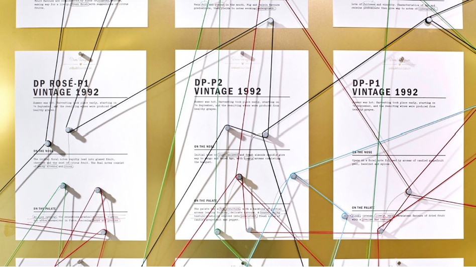
Dom Pérignon
For the launch of its 2005 Vintage, Dom Pérignon embarked on a unique journey to articulate what sets its champagne apart as the world's premier choice. The heart of this campaign was the establishment of a dedicated research lab, complemented by the creation of interactive materials designed to decode and share the essence of Dom Pérignon's storied legacy.
The research lab played a pivotal role in dissecting the intricacies of Dom Pérignon's champagne-making process. It delved into the complexities of viticulture, the nuances of the champagne's flavour profile, and the historical evolution of the brand. The goal was to extract key factors that contributed to the brand's distinction and allure.
The creative brilliance of Dom Pérignon's solution lay in how these findings were communicated. Rather than relying on conventional marketing materials, they developed interactive, user-friendly content that brought the brand's story to life. This included immersive digital experiences, interactive storytelling elements, and visually rich media that detailed the craftsmanship behind each bottle.
These materials were not just informative but also engaging, providing Dom Pérignon’s network of merchants with a rich narrative and detailed insights. The approach transformed complex wine-making processes and historical data into compelling stories, enabling merchants to convey the unique value and heritage of the brand to customers. It also reinforced Dom Pérignon's position in the luxury market, highlighting its commitment to excellence and its distinguished legacy.
Spotify
Spotify's "Wrapped" campaign serves as an outstanding example of data visualisation in the entertainment and streaming industry.
Spotify Wrapped is a data-driven storytelling initiative that provides personalised year-end summaries to its users, showcasing their most played songs, artists, and genres over the past year. The summaries are not just lists of data; they are crafted into a narrative about the user's musical journey throughout the year. This personalised storytelling approach transforms user data into a compelling, shareable story that resonates emotionally with users and enhances their experience with the platform. Not only that, but Spotify transforms streams, listening durations, and genre preferences into colourful graphics, charts, and animations. These visualisations are easy to understand and visually appealing, making the data not only digestible but also enjoyable to explore.
Desigual
In the dynamic landscape of global e-commerce, Desigual faced the challenging task of consolidating and synthesising vast data streams from its e-shops spread across 30 countries. The goal was clear – integrate data into a sophisticated system to empower stakeholders with real-time access to key business intelligence insights.
Desigual's innovative solution was the development of a dynamic centralised sales platform. This platform was designed to enable stakeholders to monitor and analyse e-Store Key Performance Indicators (KPIs) and consumer behaviour in real time. Through this initiative, Desigual seamlessly integrated diverse data streams, significantly enhancing its ability to make informed, data-driven decisions. This strategic move not only streamlined the sales information process but also provided a comprehensive and real-time view of the sales landscape, demonstrating the transformative power of effective data visualisation in global business operations.
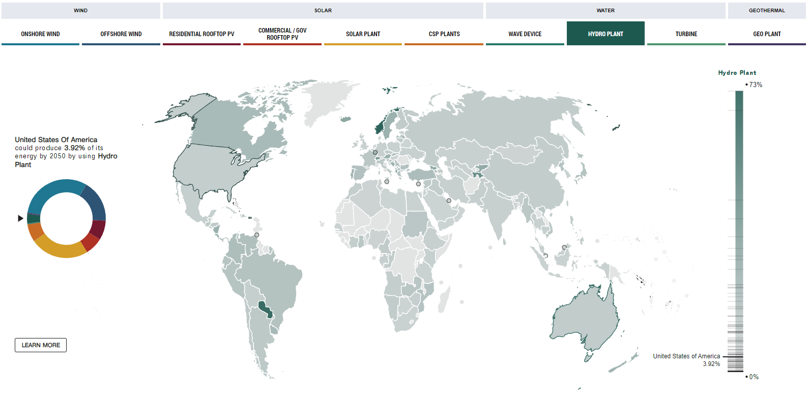
National Geographic
National Geographic, renowned for bringing complex stories to life, embraced the challenge of presenting Mark Jacobson's vision for a fossil fuel-free United States in an engaging, accessible manner. Their creative solution lay in developing an interactive, state-by-state digital resource that transformed the dense scientific roadmap into an immersive storytelling experience.
The genius of National Geographic's approach was in its simplicity and interactivity. They crafted a user-friendly interface that allowed readers to navigate through each state’s specific plan for transitioning away from fossil fuels and nuclear power. This interactive map was not just a visual tool; it was a journey allowing users to explore various scenarios and outcomes based on different states' actions. By clicking on a state, users could uncover detailed insights into how renewable energy sources like wind, solar, and hydro could be implemented effectively.
This data visualisation example turned a complex, data-heavy topic into an exploratory adventure. Readers were empowered to chart their learning paths, delving into the areas that interested them most. The shareability of the project increased its reach, encouraging discussions and spreading awareness about sustainable energy solutions. National Geographic’s innovative approach exemplified how data-driven storytelling can simplify complex subjects, making them more relatable and engaging for a wider audience.
Airbnb
Finally, Airbnb uses data visualisation to optimise both the customer experience and operational efficiency. By analysing vast amounts of data from their global listings, Airbnb creates detailed visualisations that help users find accommodations that suit their unique preferences. These visualisations include heat maps for pricing, location desirability, and other key factors. For hosts, Airbnb provides analytics on their rental performance, offering insights that help them improve their listings. This strategic use of data visualisation enhances the user experience and decision-making, exemplifying best practices in the hospitality and tech industry.
The Future of Data Visualisation
The future of data visualisation is bright, with endless possibilities for innovation and creativity. As we've seen from today’s data visualisation examples, when done effectively, this medium can transform how we perceive and interact with information, leading to more informed decisions and providing customers with a deeper understanding of our brands, products, and services.
Beyond its capacity to clarify and interpret complex datasets, data visualisation holds the power to build compelling brand narratives and significantly enhance the user experience. Through carefully crafted visual stories, brands can communicate their values, mission, and insights in ways that resonate deeply with their audience, fostering a stronger connection and engagement.
As this field continues to evolve, it will undoubtedly bring new insights and inspiration, not only contributing to a data-rich future but also shaping the way brands connect with their communities through immersive and interactive visual experiences. This ongoing innovation in data visualisation promises to redefine our interaction with data, making it an integral part of storytelling and brand strategy in the digital age.

